United Health of Central Maryland
Project
- Website Redesign
Position
- Content and Research
Timeline
- March 2022 - June 2022
Tools Used
- Figma, Google Suite, Zoom
Background
In a group of 5, our goal with this website redesign was to improve the UI, to encourage and promote giving and donations from outside corporate giving and to increase community involvement. This was a self started project.
Problem
The website at the time was very ineffective, clunky, and had plenty of unfished sections, creating an idea of suspicious activity and lack of care. It made finding out how to contribute or receive and aid in all forms extremely difficult, with more effort than neccesary to manuever through the site.
Solution
Create an improved experience by guiding users through a more coherent flow, with a inviting visual identity. Improving aspects such as trustability with site visitors, and improving the donation page for increase in overall giving of the site
RESEARCH
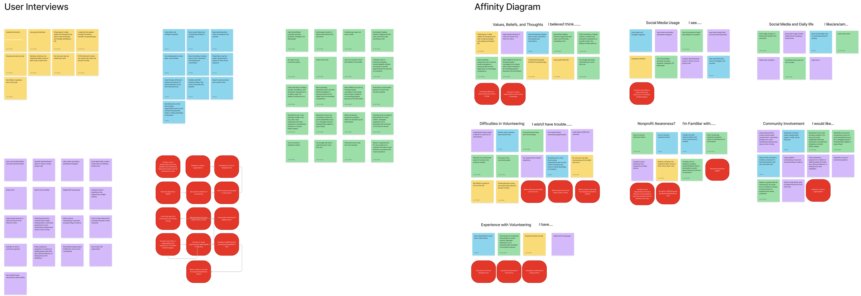
Beginning with our Proto persona, after an examination of the United Way website at the time, we came up this identity of someone looking to support the organization. We structured our interviews with questions looking to understand how:
- People learn about non-profits and interact with them
- How one would want to see support and assitence in their community
- What makes community service, donations, just helping in general attrative to people. What experiences helping others made it memorable and how it made people feel.
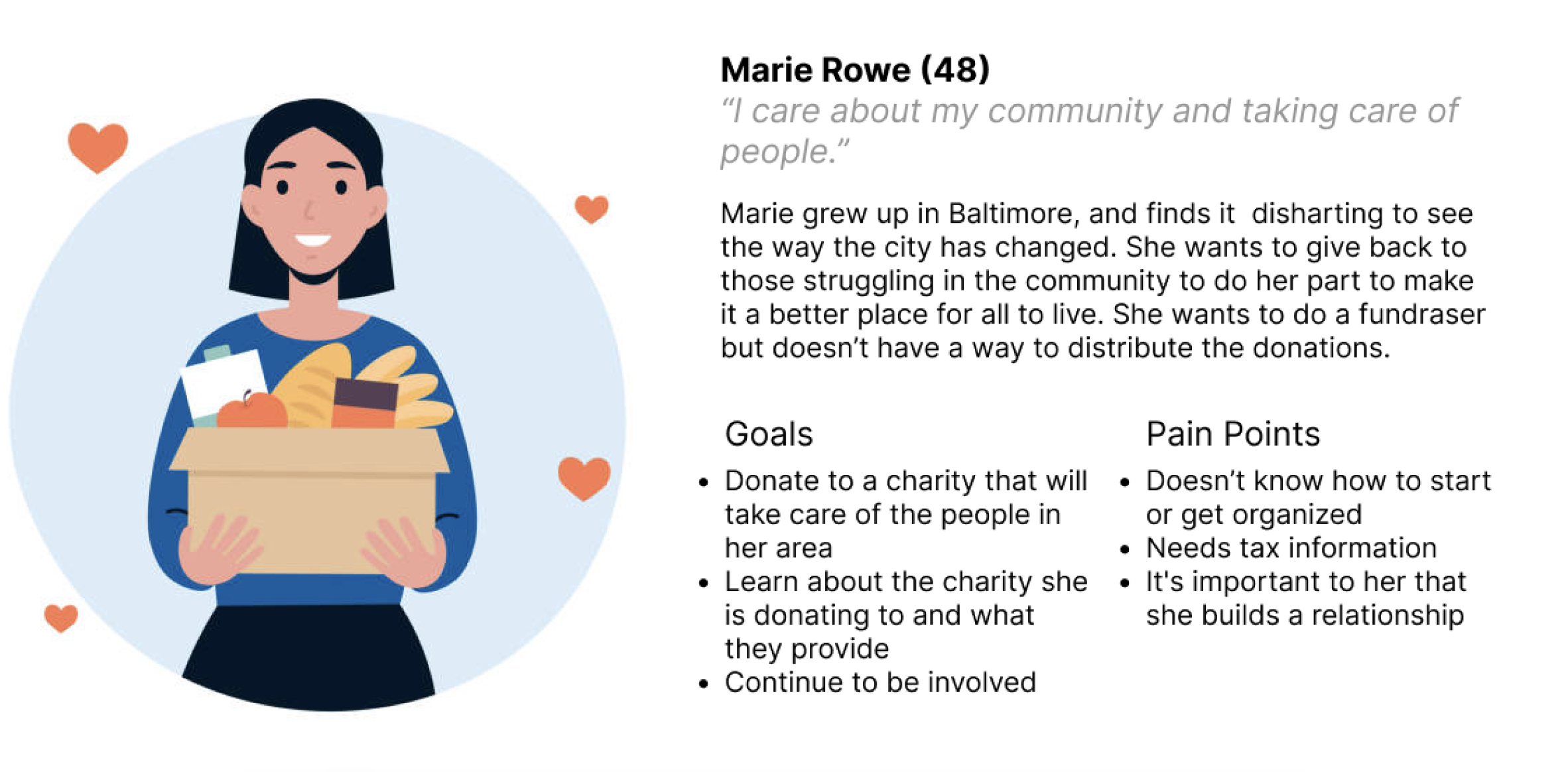
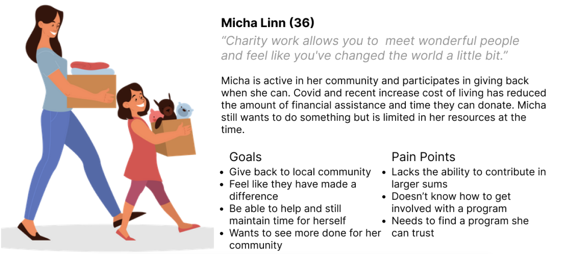
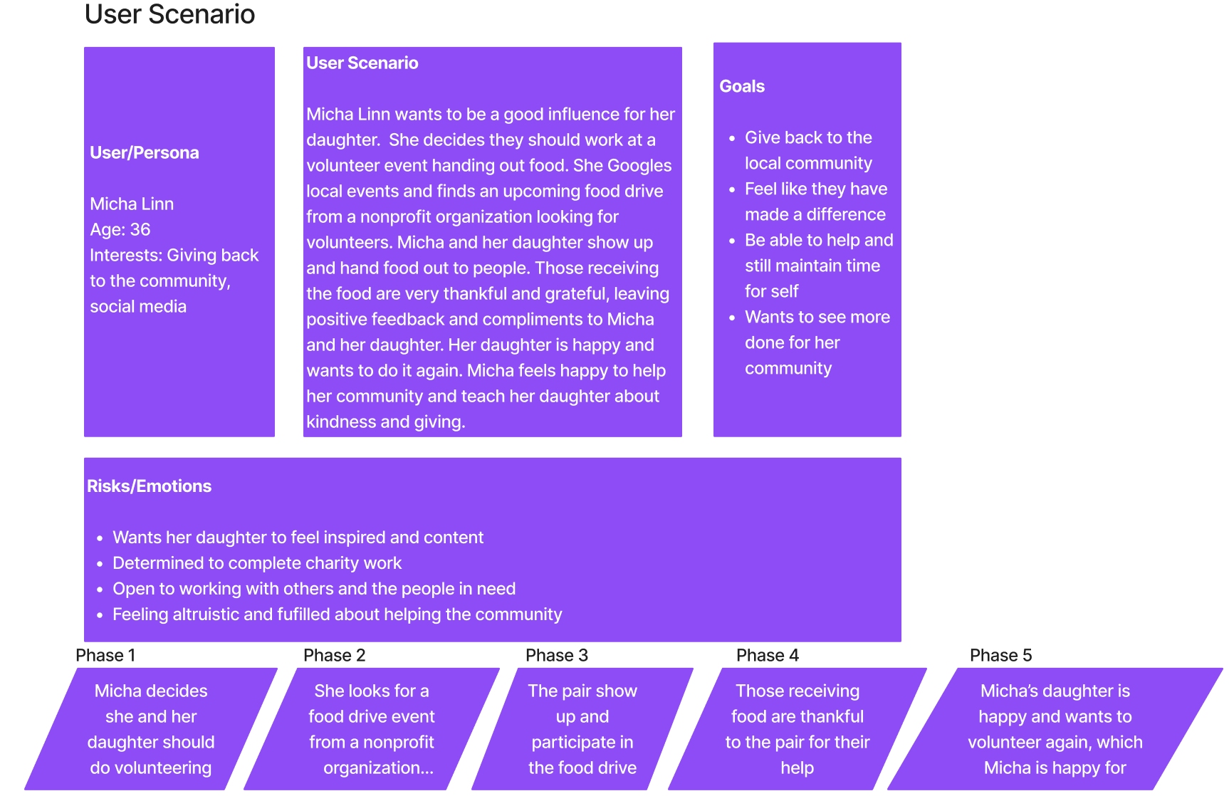
User Persona
After interviewing a mixed group of men and women in their late 20's to 30's, we composed a more well rounded user persona, giving us insight as to where the United Health website struggled, and what aspects of the sight needed more emphasis to increase user's interacation and participation with the organization.
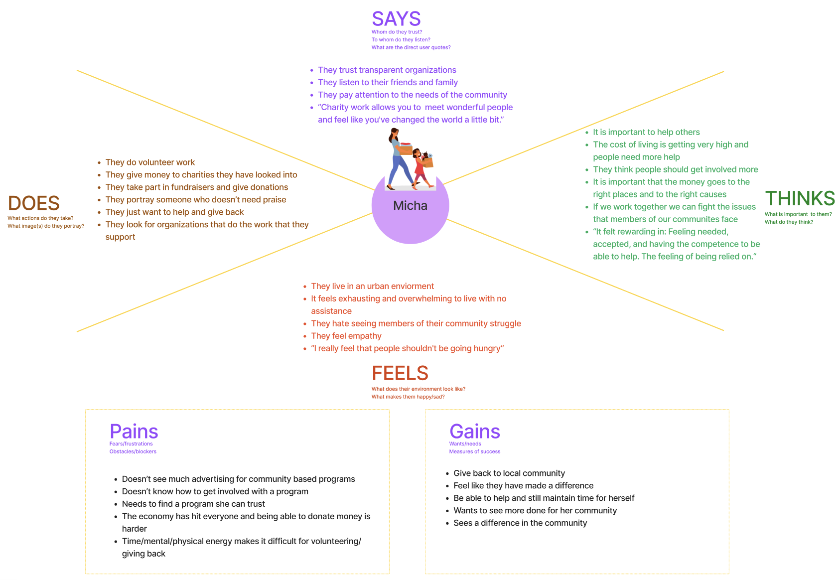
User Insight
People who want to donate/volunteer need to find out where/how to donate their goods and time because the lack of information on where to help their nonprofit discourages them from actually donating or providing help.
Problem Statement
United Way of Central Maryland was created for people who need assistance with housing, jobs, and food. We found that the UWCM’s Website wasn’t providing enough direction for those looking to help the nonprofit, which can discourage users from donating and thus move to help other organizations. How might we improve the UWCM's Website so that those looking to donate or volunteer can easily contribute, measure through increased clicks and traffic on the donate button, showing higher contributions overall, and better volunteer tunrout.
UX Hypothesis
If we reorganize the data presented on the home page and make the donation button more apparent and frequent then we can increase community trust and involvement in volunteering and contributions.
Value Proposition
Our vision is to create an updated design for United Way that inspires people to find the joy in getting involved in their communities by volunteering and donating. We aim to create a new website that facilitates a more sustainable business and a better shared future, that makes a difference in people’s lives and communities.
IDEATION
After our reseach and defining our goals for this redesign, we began looking more closely at our user persona, and how we can structure the website for improved usability and higher community involvement for the organization.
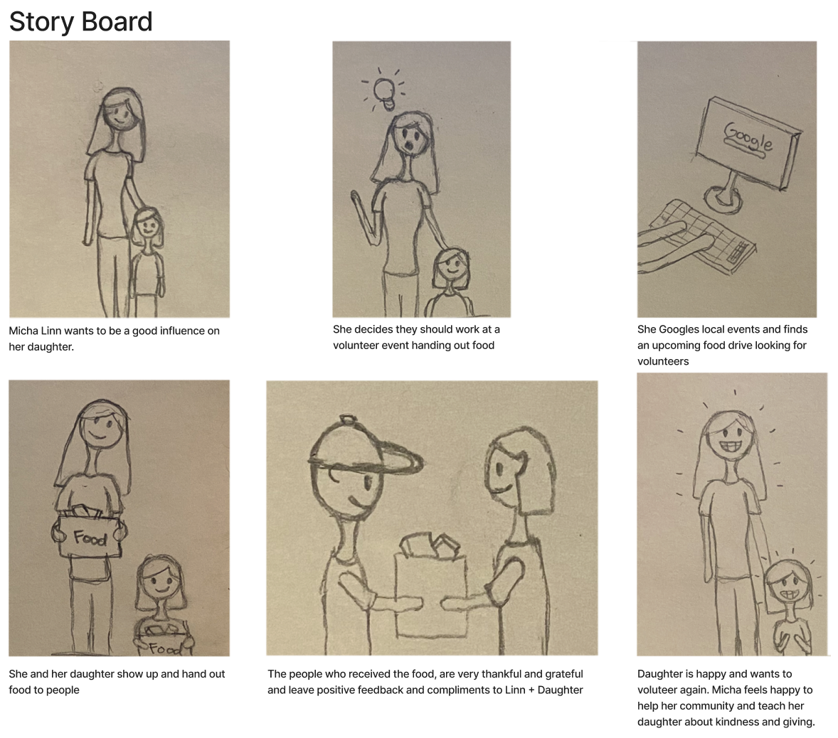
Our team began coming up with ideas based on our research for the optimal set up of elements and organization of the page to prioritize donations and elements for increasing engagement.
We decided by adding more donation CTA's and emphasizing the impact United Way has had on the community, this would match our goals in improving the website.
We also conducted a Heuristic Analysis of the current website at the time to examine where the site was lacking, and where we could improve.
After a competitive analysis of other Non profits such as the Salvation Army, Feeding America, and St Jude's Children Hospital, we examined what elements were creating success amoung these organizations and how we can implement them in our own design.
ITERATIONS, DESIGNS AND TESTING
With all the prior work done, we began our re-design of the UI with a base format and our desired user outcome in mind.
Low Fidelity Version
Mid Fidelity
We then implemented our moodboard using data and media I collected, to focus on showing people with smiling faces, to provide users with a sense of trust and comfort with the site.
As our goal was to increase community engagement, the bright color still met accessability guidelines and our images promoted calm and familiarity with users coming to the site.
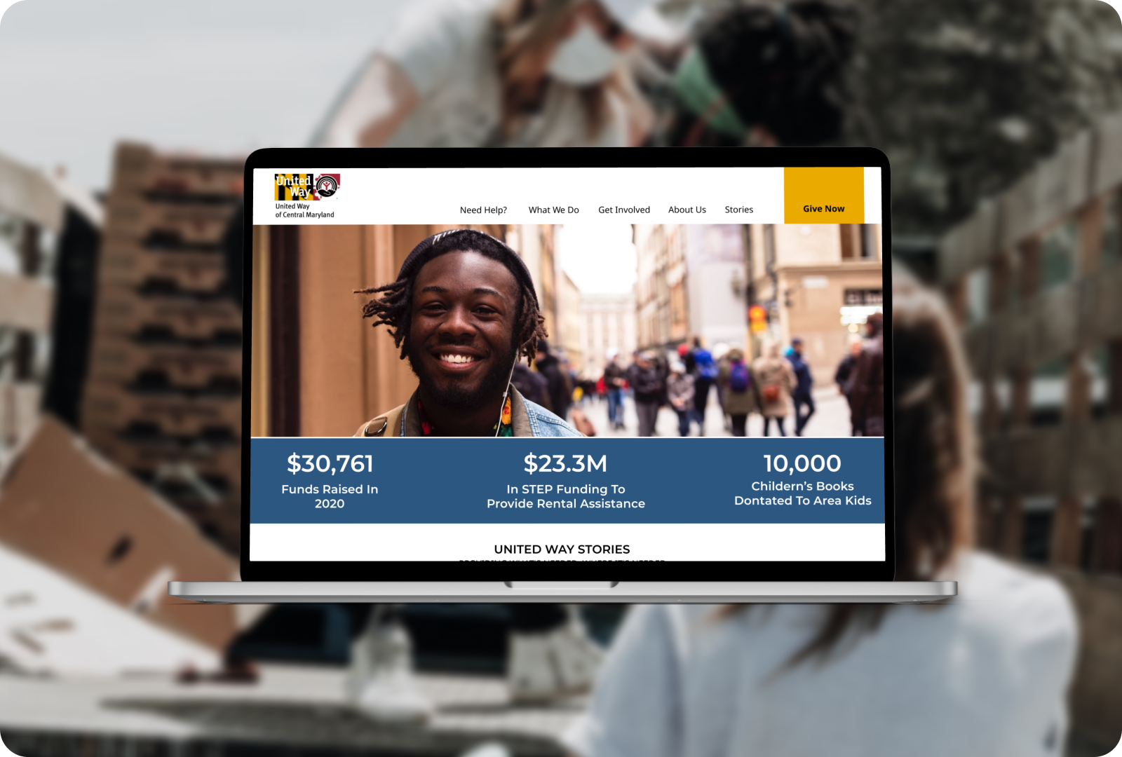
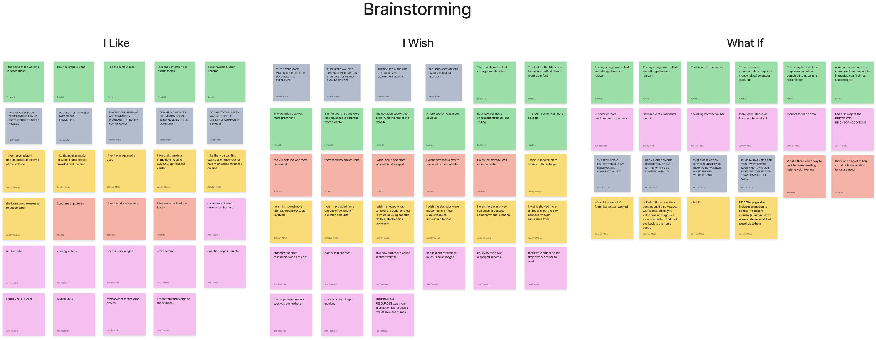
End Design
With some feedback after user testing and review, we made the final changes to the design and prototype to make a smooth user flow and make sure our elements stand out by increasing contrast.
LESSONS LEARNED
In conclusion, some steps we believe we could have taken to improve the quality of the design and take it to the next level, were to:
- Better organize our tests, to get better feedback, just more testing overall to get a wider range of perceptions on our work.
- More research into user stories, to present more testimonials on our design and enforce more of the impact United Way has had on it's community
- Speak directly with more donors/United Way members. We were able to speak to a few donors, but nearly to level as other groups had available to them
- Improve our documentation that organizes our design system and goals in a clear document such as in a PRD
Regardless though, I had a great time learning more on this project working in a small group, and expanding my skills beyond the standard UI/UX designer role. It allowed me to see what I can do better to provide support and tools that make the design process easier for fellow designers, or myself in that role.
More Projects
RENDERWebsite and Mobile Design
RespoAIWebsite, Mobile & Brand Idenity
National Security AgencyWebsite Redesign
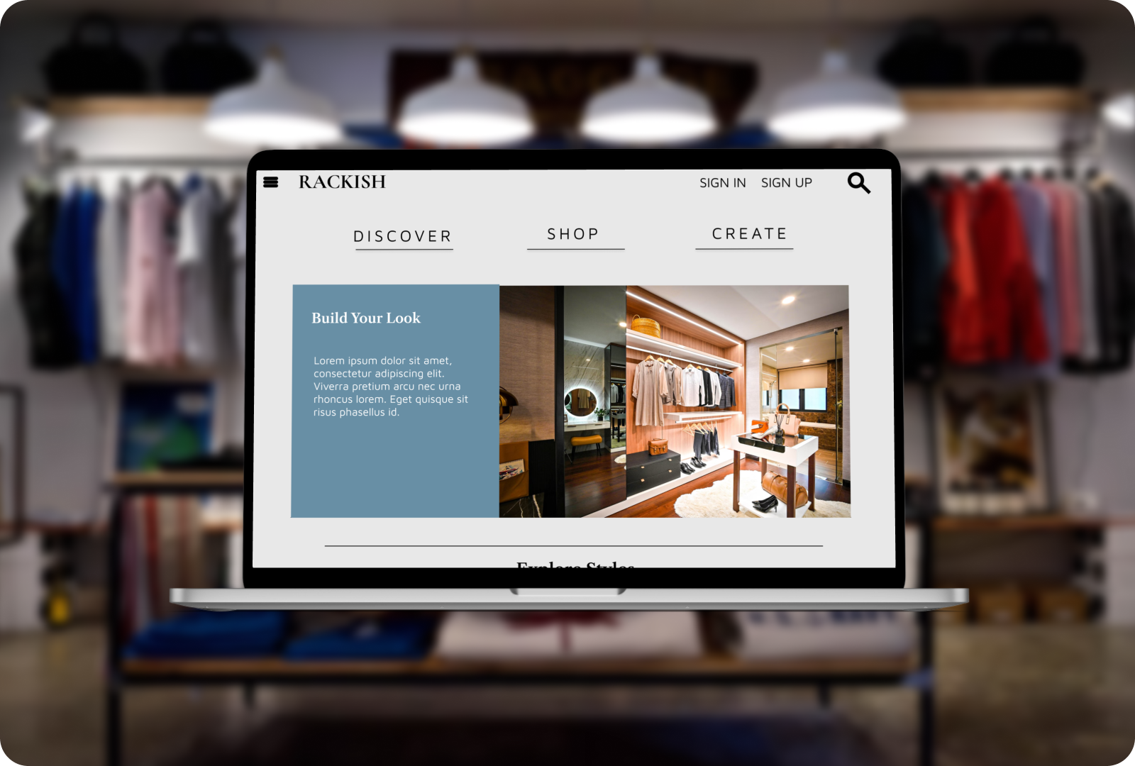
RackishWebsite Design
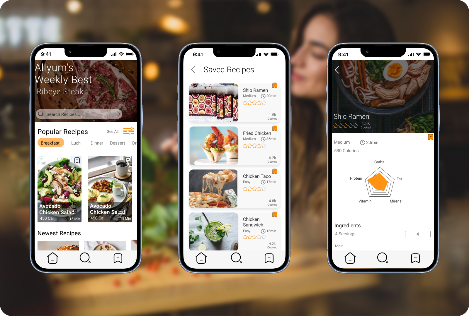
AllYumApp Design
