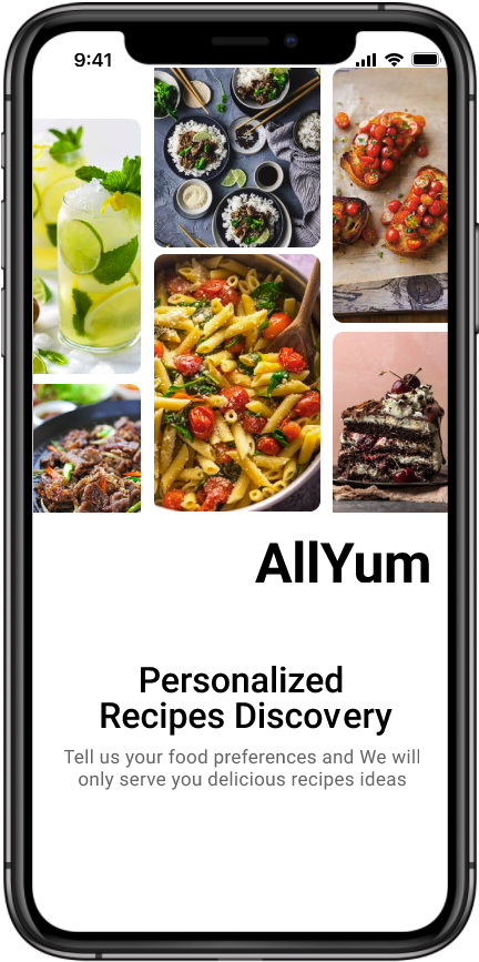
AllYum
Project
App Design
Position
Product designer
Timeline
March 2022 - April 2022
Tools Used
Figma, Google Meet, Zoom, OBS
Objective
The aim of this project was to create a food app designed to simplify cooking and recipe search, for an easy and worry free time enjoying meals. With the focus on those with dietary restrictions or a desire for more food discipline, this app would be an easy way to track macro nutrients and fufill user goals of improved health or ease of life.
Background
AllYum was an app done with myself and a partner, designed to be an all inclusive food destination. The goal being, to bring back flavor and choice to many with dietary restrictions, or specific lifestyle prefrences that can make cooking overwhelming.
Problem
When it comes to cooking, users with allergies, certain diseases, or issues that require an off standard lifestyle, can face difficulties making meals that meet their needs and satisfying a desire for taste and flavor.
Solution
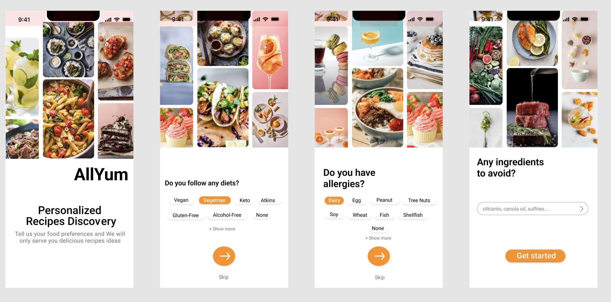
Create a recipe database, that recommends foods based on users dietary preferences and restrictions with a filtering system and based off user habits.
Design Process

RESEARCH
For our interviews, to get the best feedback from users we looked for potential health goals and characteristics, to create a set of questions that would best help us gain perspective for our ideal user.
- To understand the dietary lifestyles or restrictions one may have, and how it affects their day to day
- The users current cooking habits
- Learn about their culinary interest and spending habits with food.
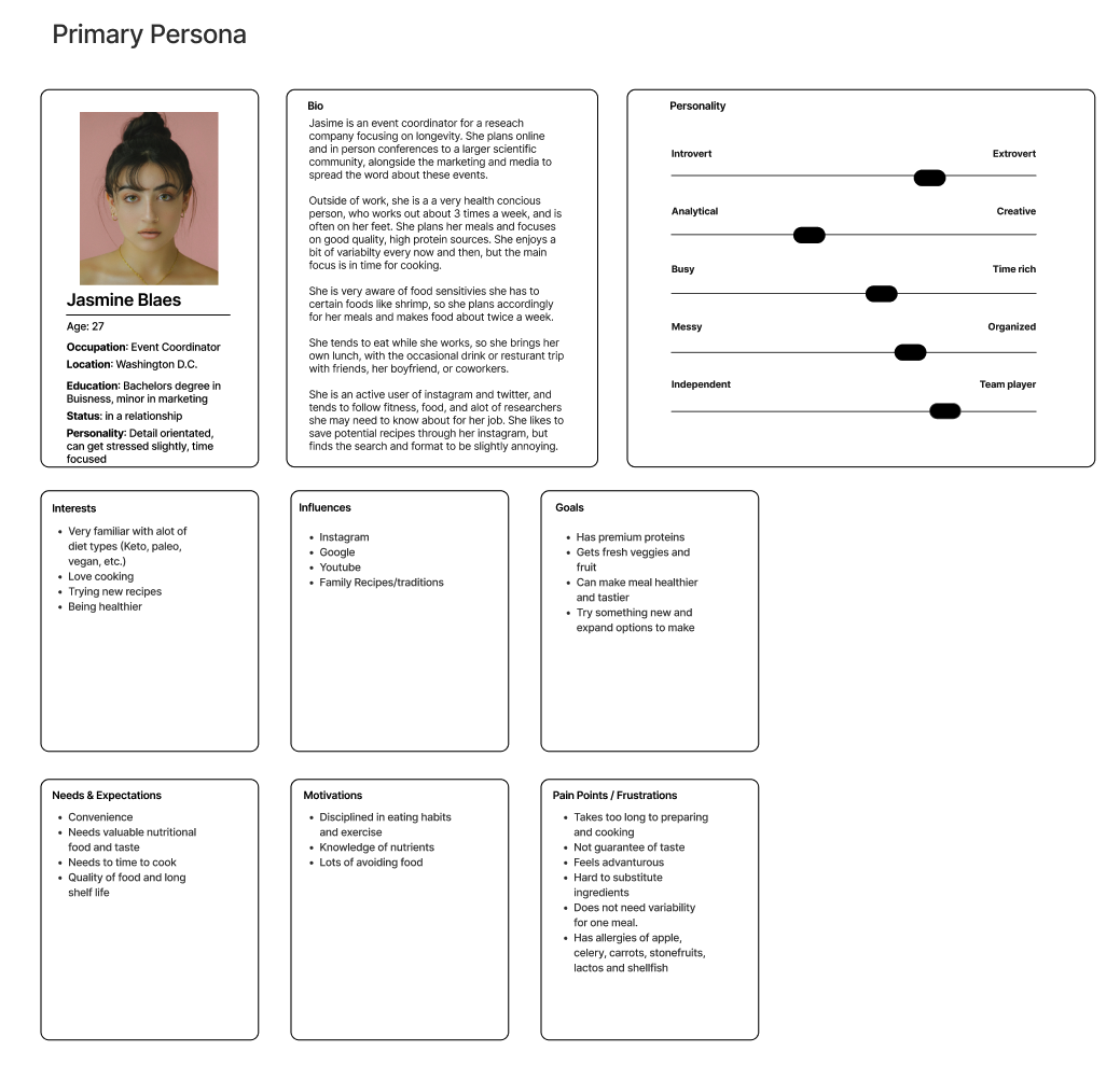
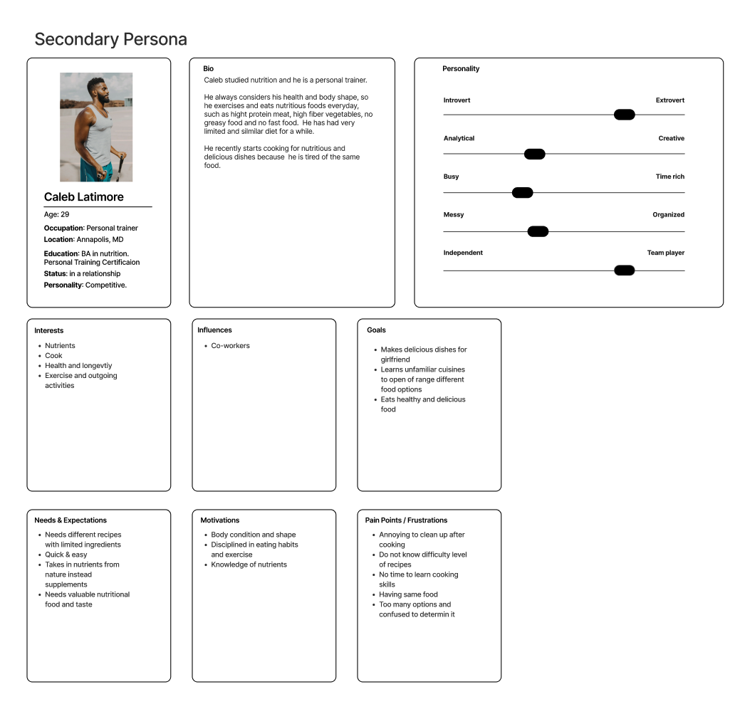
We interviewed majorily males and discovered that guys prefer the ability to subsitute foods, find guidance/tool based recipes, and a way to save and easily reach these resources. Intially aimed towards serving a female based audience, we decided to still focus on a female primary user persona, with a secondary male user persona.
DESIGN
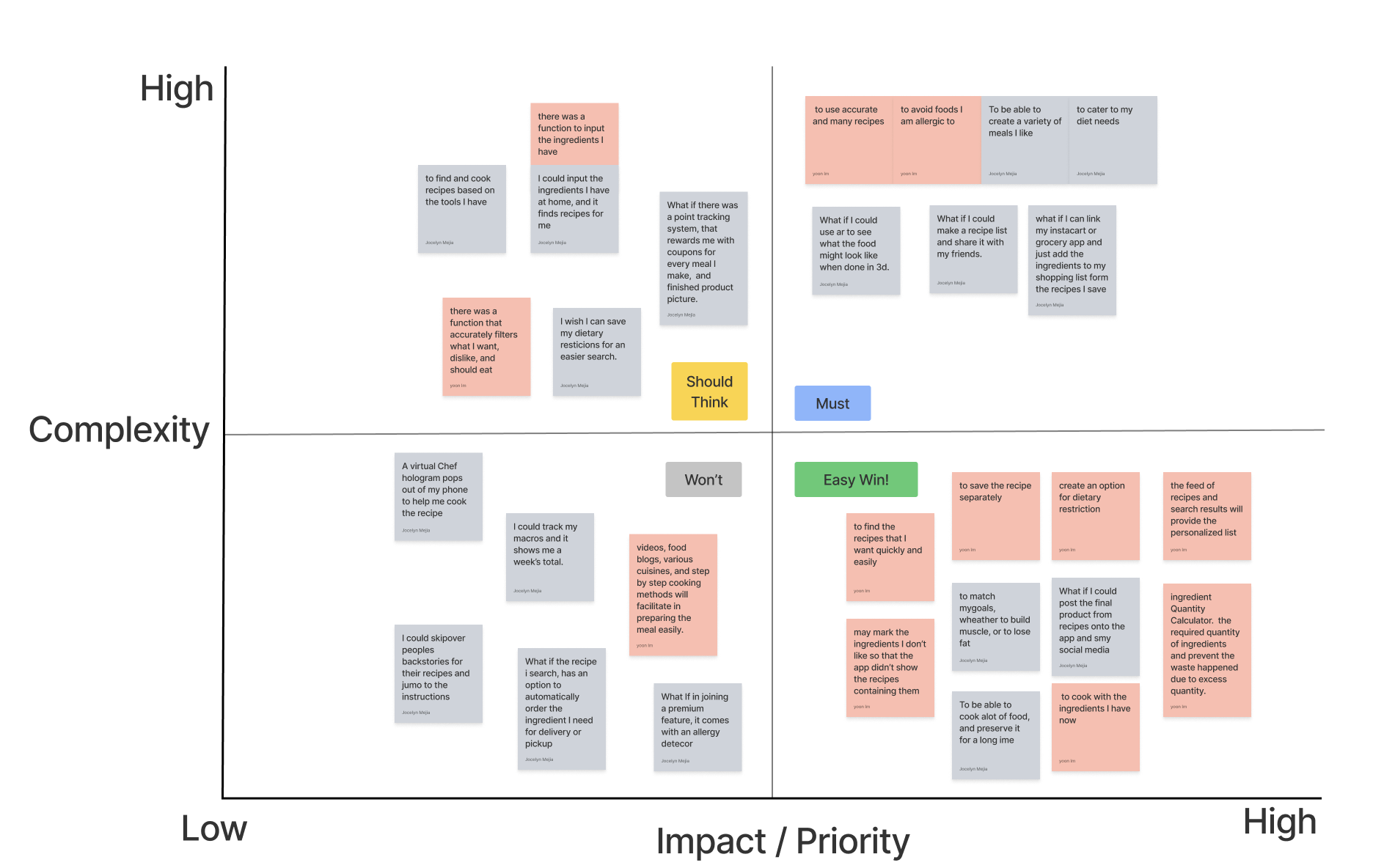
Through a competitive analysis of other recipe sites and food providers, our direct and indirect competitors provided options regarding both lifestyle and allergens, but on a very limited degree. The closest was a direct competitor yummly, which was using a similar concept to what we had in mind, directed at health conscious users though a meal prepping/tracking format.
We decided to distinguish ourselves by offering a more detailed filter system for those dietary preferences.

ITERATIONS
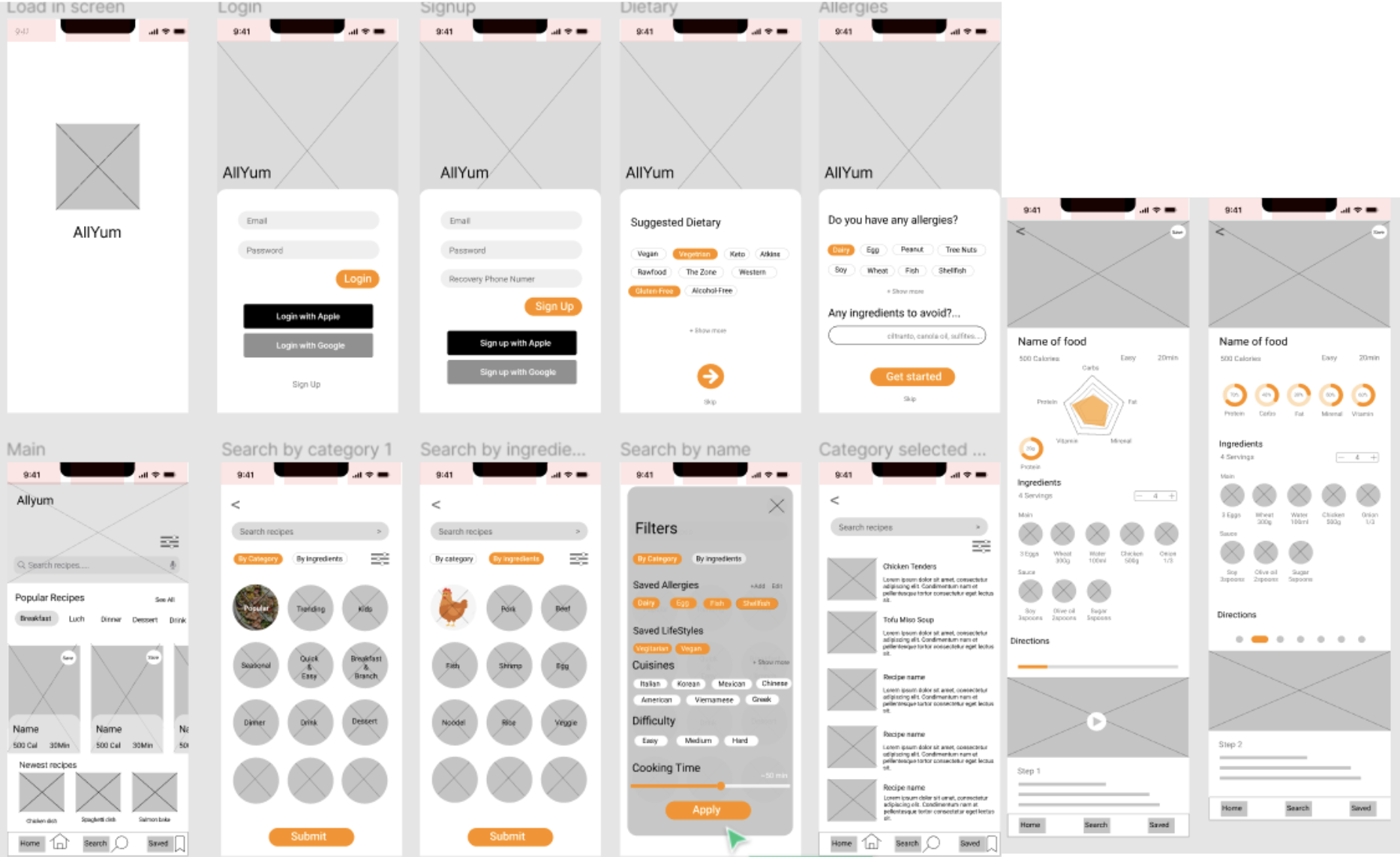
In our intial wireframe, our goal was a simplistic design that would be easy to navigate through, using images to lead the user to each page. As we know humans are heavily attracted by things visually, using pictures would help entice users while hungry with the promise of a delicous meal with little barrier to entry.
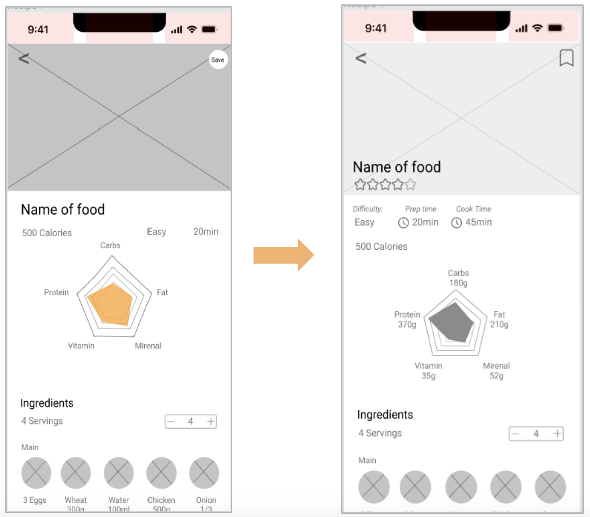
Our user testing showed a need for a bit more guidance and direction in our screens. We implemented this through additional labels, and moved around some of the features for a clearer placement and to better indicate the purpose.
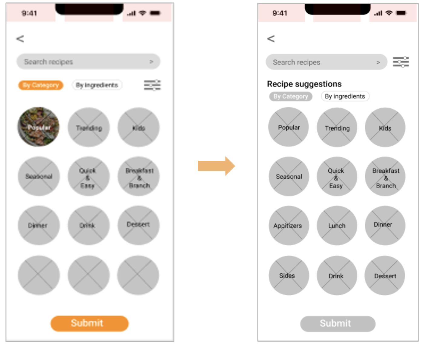
Low Fidelity Prototype
Through our interviews, testing, and given feedback, we learned to better think and view from the user perspective, and how important it is in the design process. A surface level understanding wont produce anything worth any value leading to a visually appealing, but worthless and confusing design in the end.
End Design
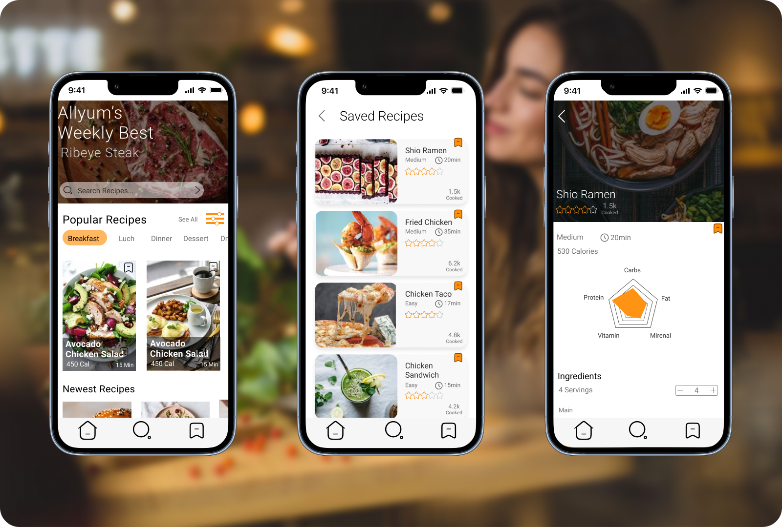
With further tests and review of the design, we were able to clarify some elements that prevented a smooth user flow. We adjusted some buttons and copy to fix this issue and bring clarity, and came up with the look to our final application.
LESSONS LEARNED
Given more time, I would have love to have implemented and tested each of the original features we wanted to apply, but we had difficulites with the time constraints. That was probably one of my partner and I's biggest challanges.
It was also interesting to see my own shortcomings with how I worked through this project, and how it could affect the quality of future work. Being too vague with my objectives and goals took away from our end project, so I learned how important it is to be as consise as possible
More Projects
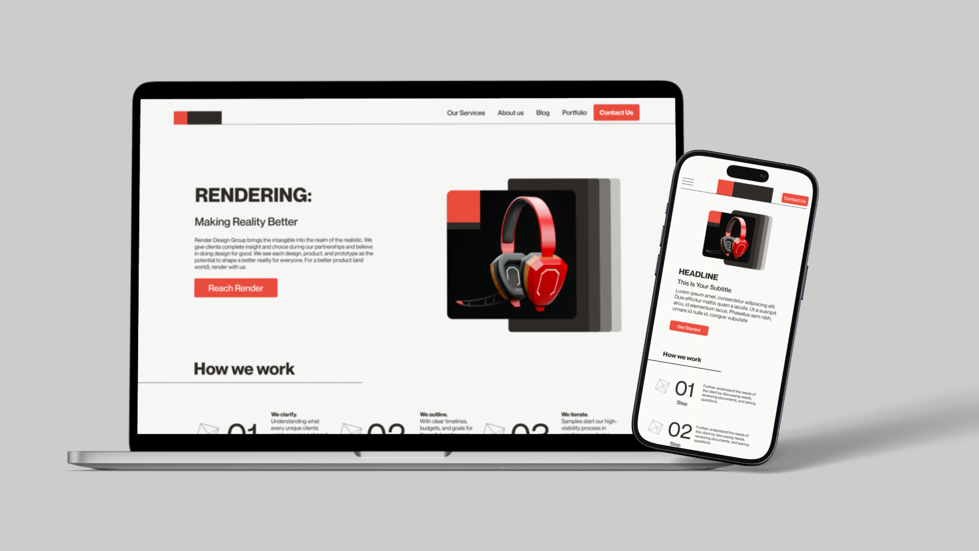
RENDERWebsite and Mobile Design
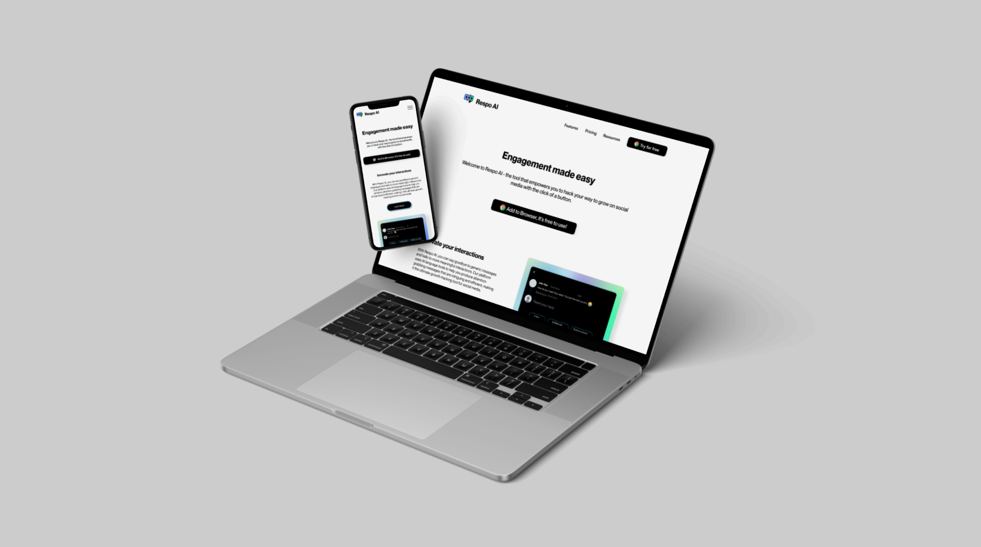
RespoAIWebsite, Mobile & Brand Idenity
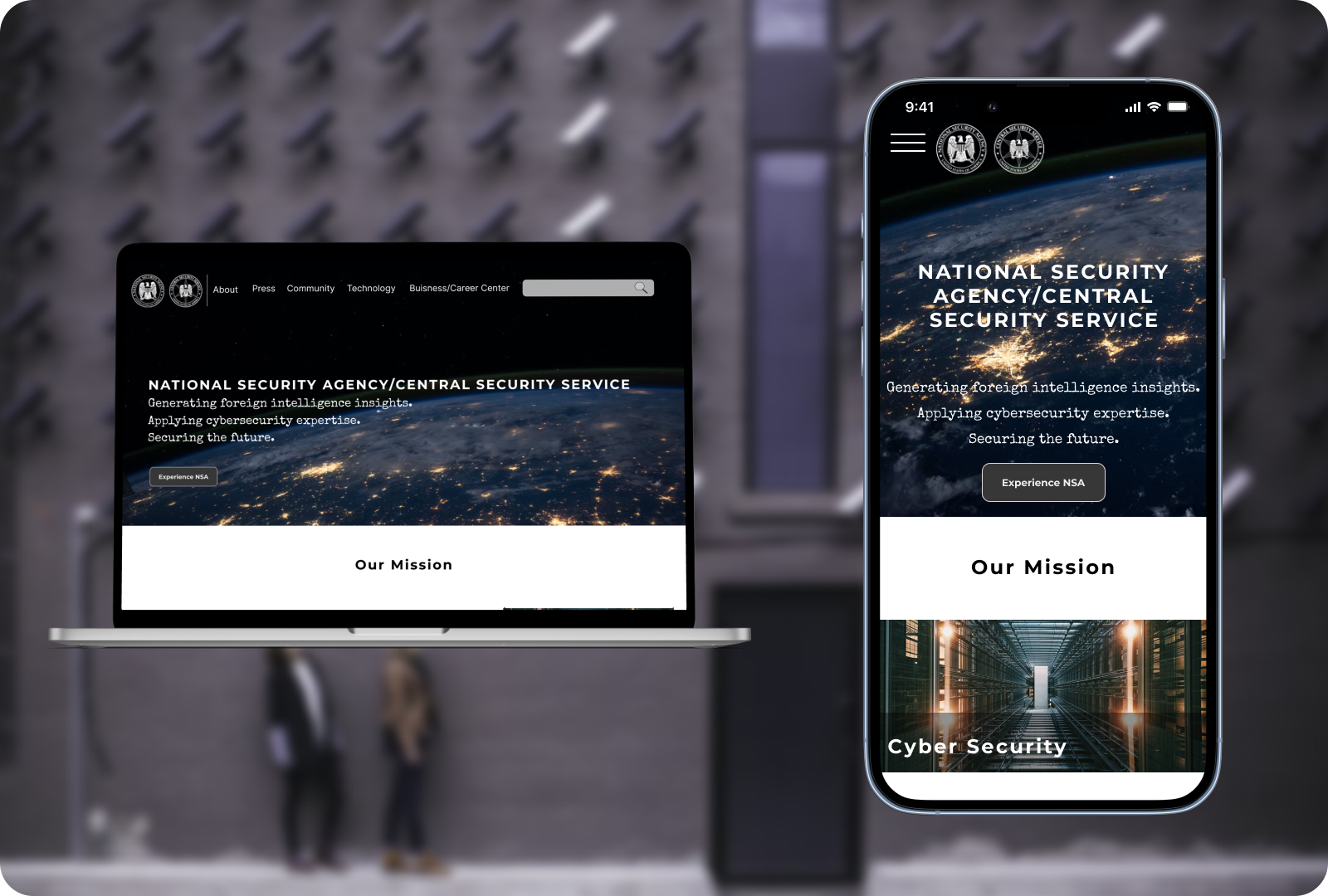
National Security AgencyWebsite Redesign
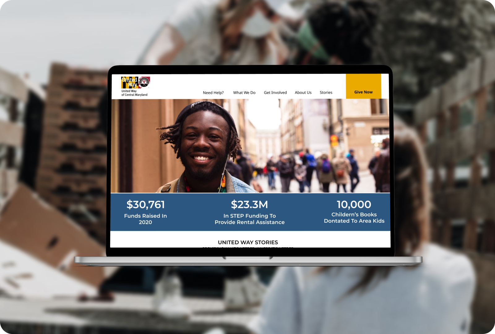
United Health of Central MarylandWebsite Redesign
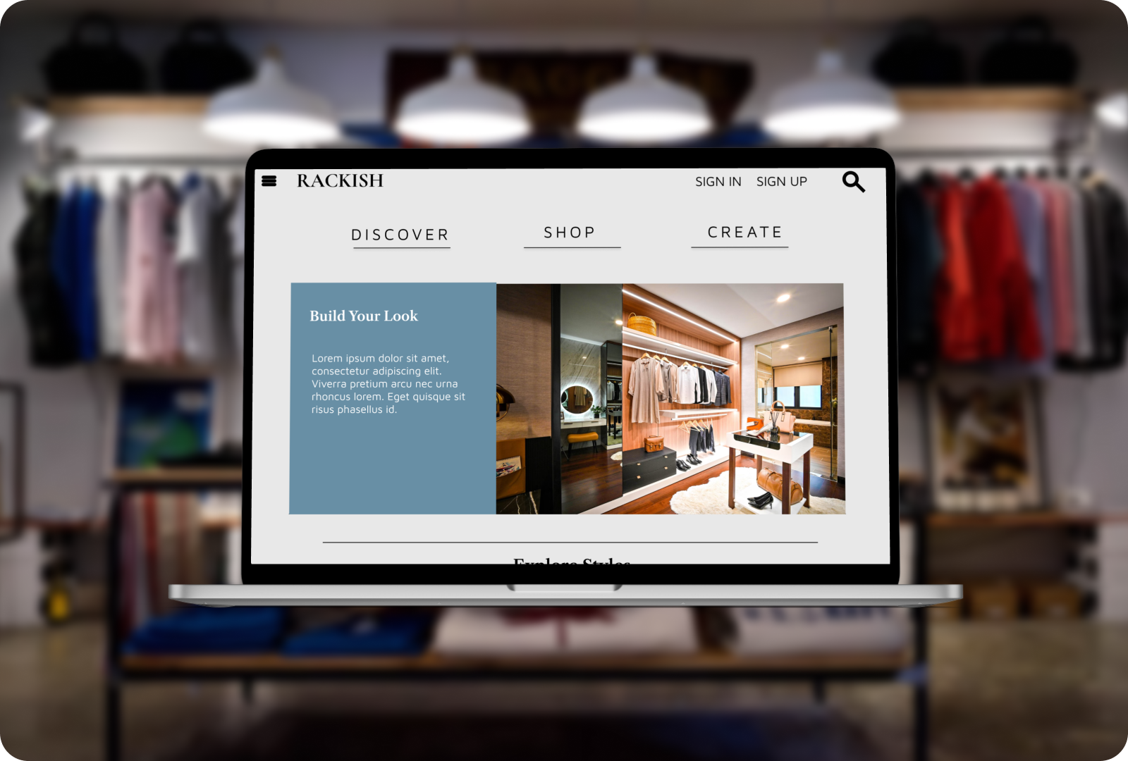
RackishWebsite Design