National Security Agency
Project
- Website Redesign
Position
- UI/UX Designer
Timeline
- April 2022 - May 2022
Tools Used
- Figma, Zoom, OBS, Google Suite, Otter.ai
Objective
My goal was to update the NSA website to improve the flow, and consistency of the pages for easy direction and search. This would improve recruitment and public view of the organization, providing a more well liked image and trust of the organization.
Background
The idea of this project was to re-design and update a government website for a better user experience, and a newer look. Starting off research with a partner, once the design and prototyping began, I worked on the prototypes alone. Our goal for our research and redesign, is to modernize the NSA Website, make it more disability accessible, and to create more concise and logically grouped pages measured through a post redesign survey and more user tests and feedback.
Problem
The website felt extrememly confusing, and difficult to navigate in searching for resources, documents, and felt very overloaded with with outdated design and content.
Solution
Guerilla user testing on the unedited NSA website, done through assigning participants tasks to test the accessibility of the website. Once tested, re-do the website with the new data to improve the userflow.
RESEARCH
Our goal for our research and redesign, was to modernize the NSA Website, make it more disability accessible, and to create more concise and logically grouped pages measured through a post redesign survey, user tests, and feedback.
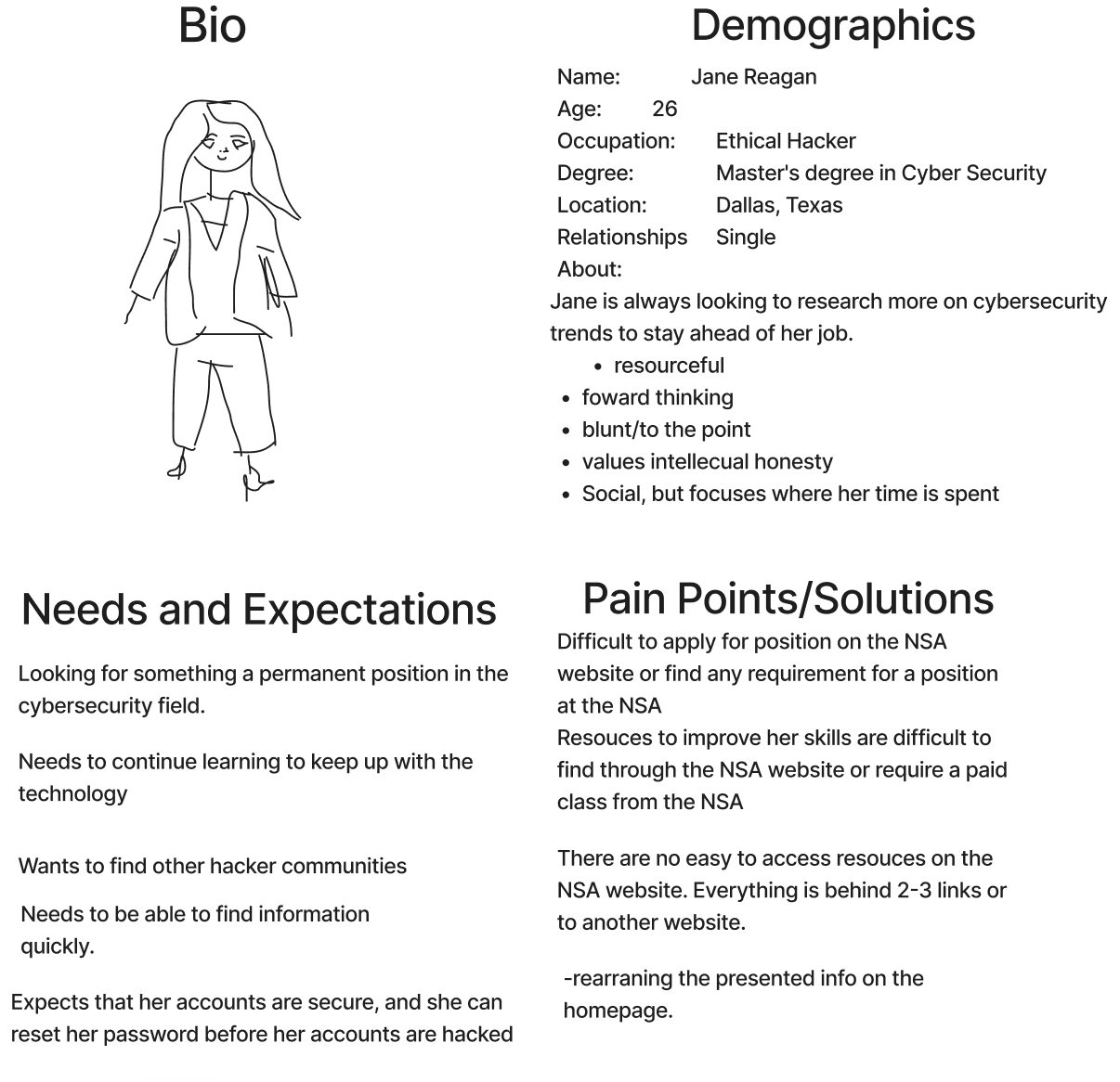
Persona
We began with a proto persona with what might be an expected user of the NSA website, estimating potential pain points and leading to how we direct our interviews and user testing of NSA site at the time.
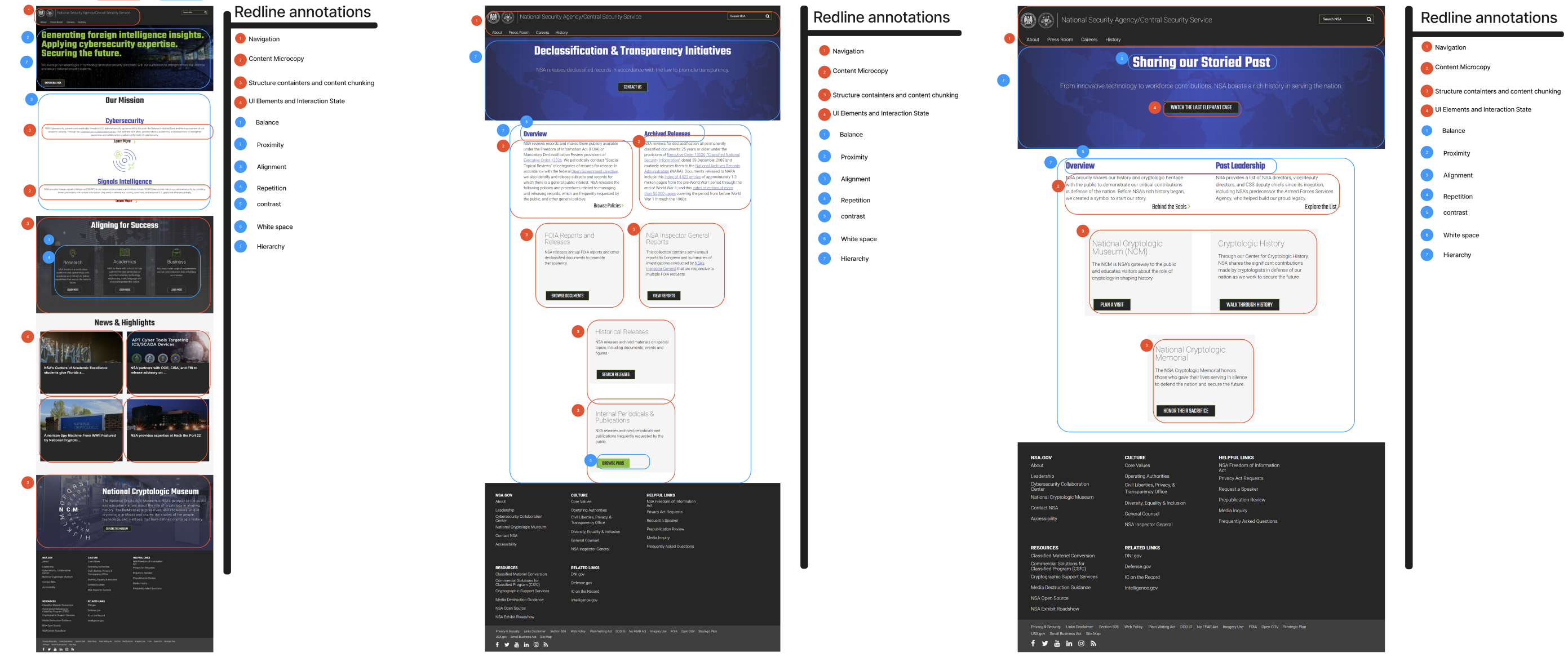
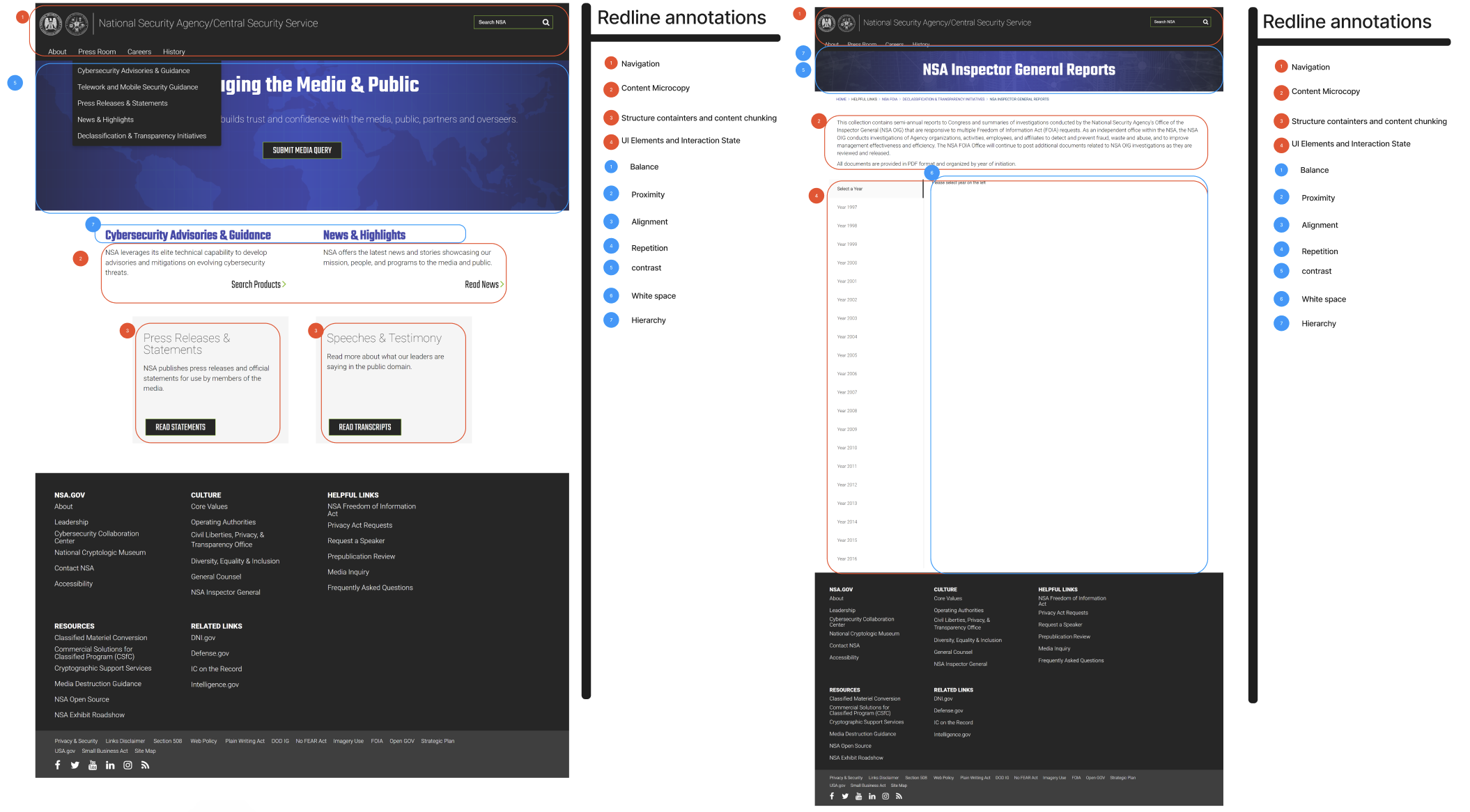
Heuristic Analysis
We conducted a heuristic evaluation of some of the primary pages of the site to see how the site was organized and mapped out. The further we went into the website, we saw that this mordern style was only on a surface level, and the buttons were confusing, leading us down an opposite direction than what we had desired.
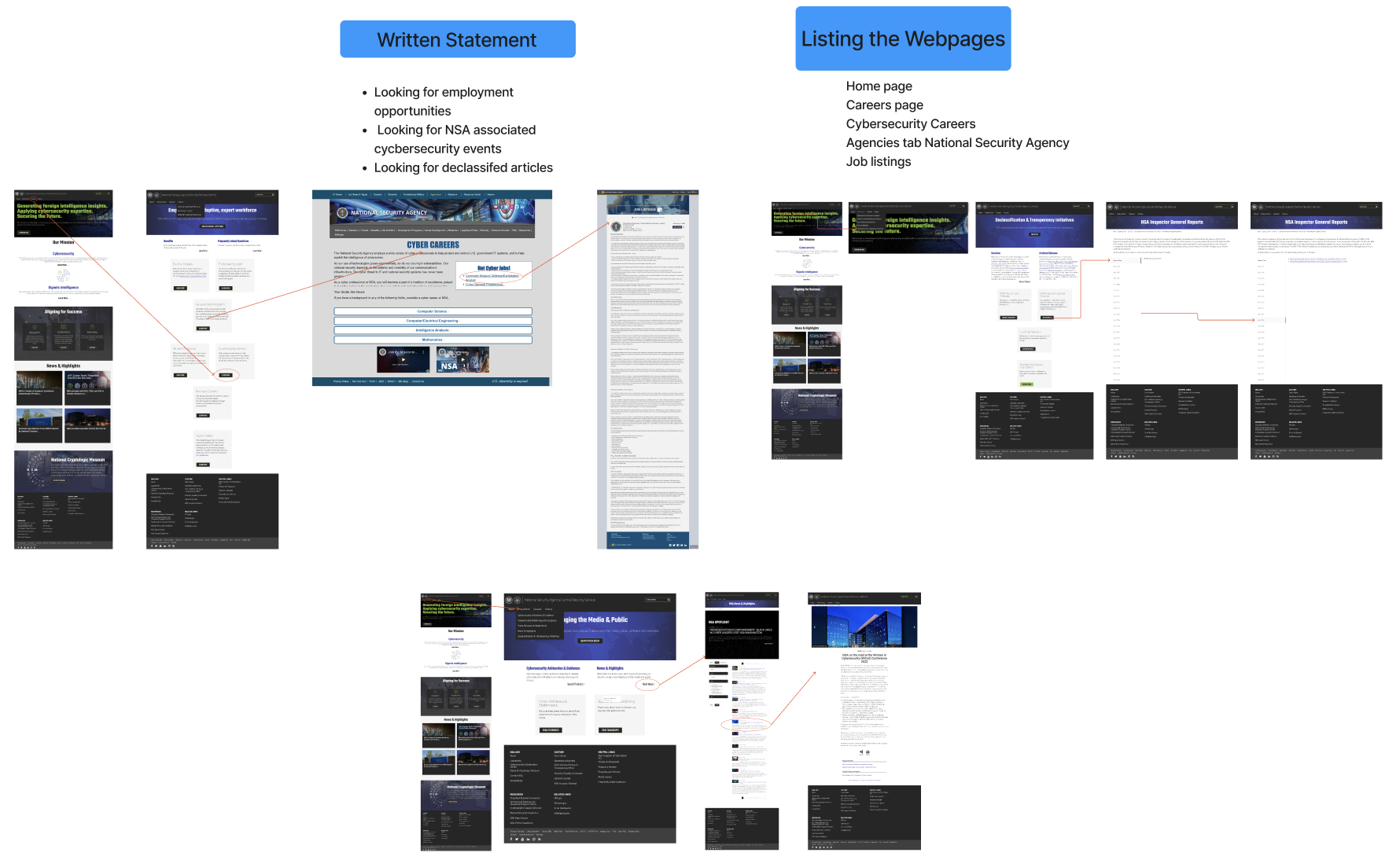
User Tests
To examine the faults of the website further and what areas needed improvement, user tests were conducted with our persona, and these tasks in mind:
Looking for employment opportunities
Looking for NSA associated cybersecurity events
Looking for Cybersecurity updated practices and trends
Looking for declassified articles
Before conducting any tests, we created a user path for 3 tasks to see how our participants would do manuevring though the site, measuring efficiency through additional clicks taken to reach the goal, and length of time taken for each task.
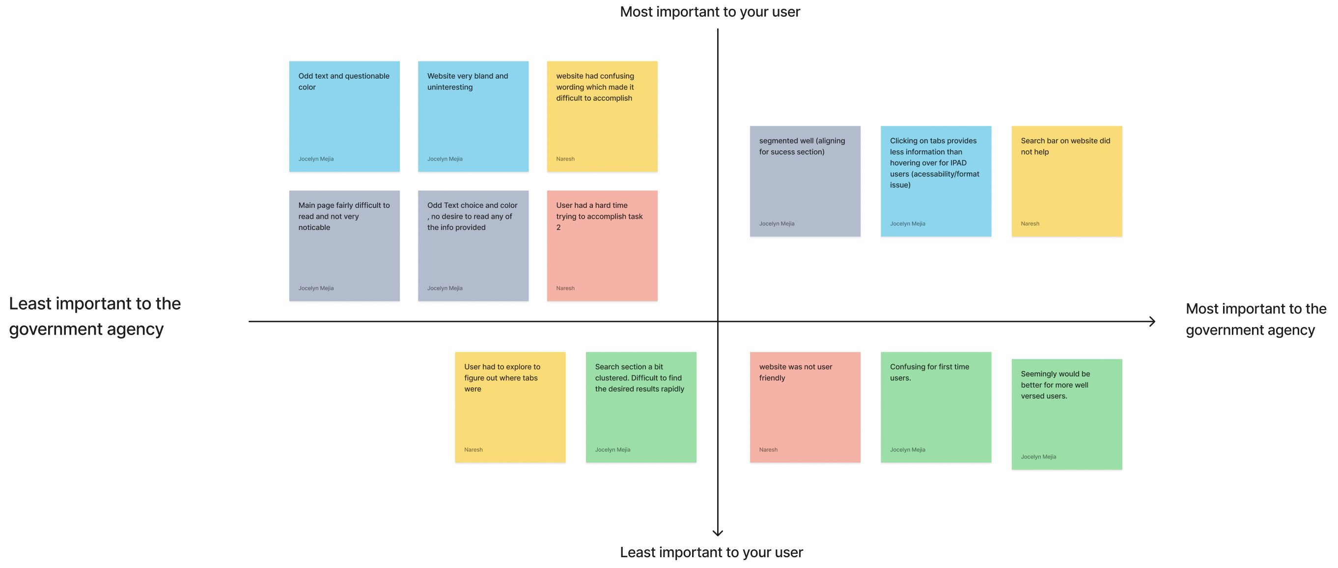
Once we had our testing results, we asked for some feedback on the look and features of the site, to see what our participants would like to see improved. The comments were seperated into a prioritzation matrix, to see where to aim our focus on the redesign. I learned that:
- The website was difficult to navigate and lacked clarity.
- The design reduced user interest in putting little to any effort in their search.
- The flow did not do well guiding users to the end goal, and usually provided less information on where to go next.
DESIGN
The intial concepts began with creating a simple and organized design, using more imagery to better direct users for a efficient and easy experience. Our testing showed that the oringinal site was very unfriendly to first time users, so the focus was to improve the website flow and feel with the content and media presented, while maintaining the identity of the association.
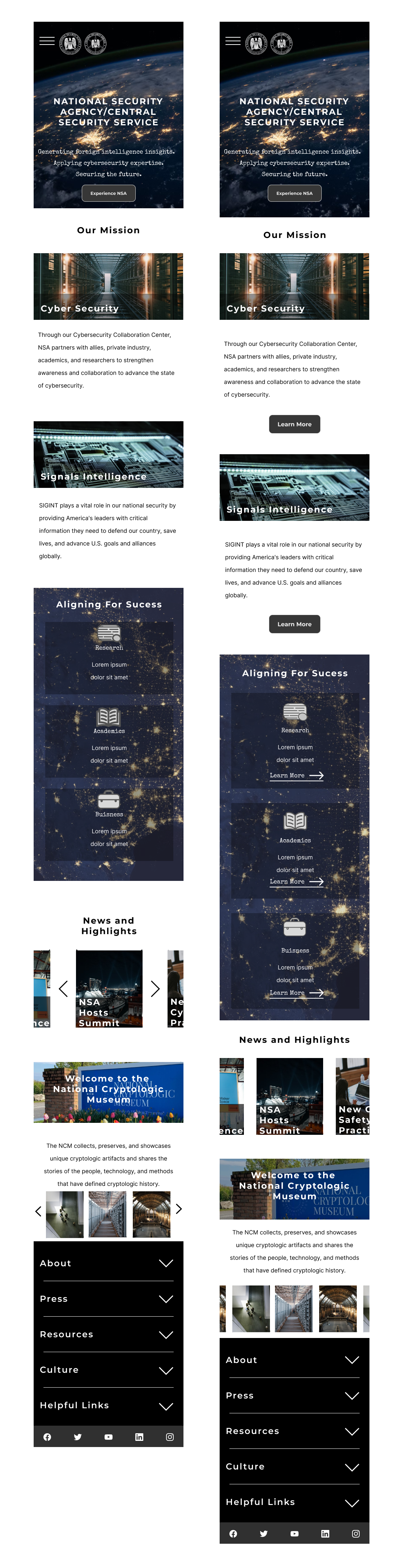
Low Fidelity Prototype
Additional tests on the revamped prototypes were conducted, to make sure the original goal of smooth flow and direction for the user was still ensured.
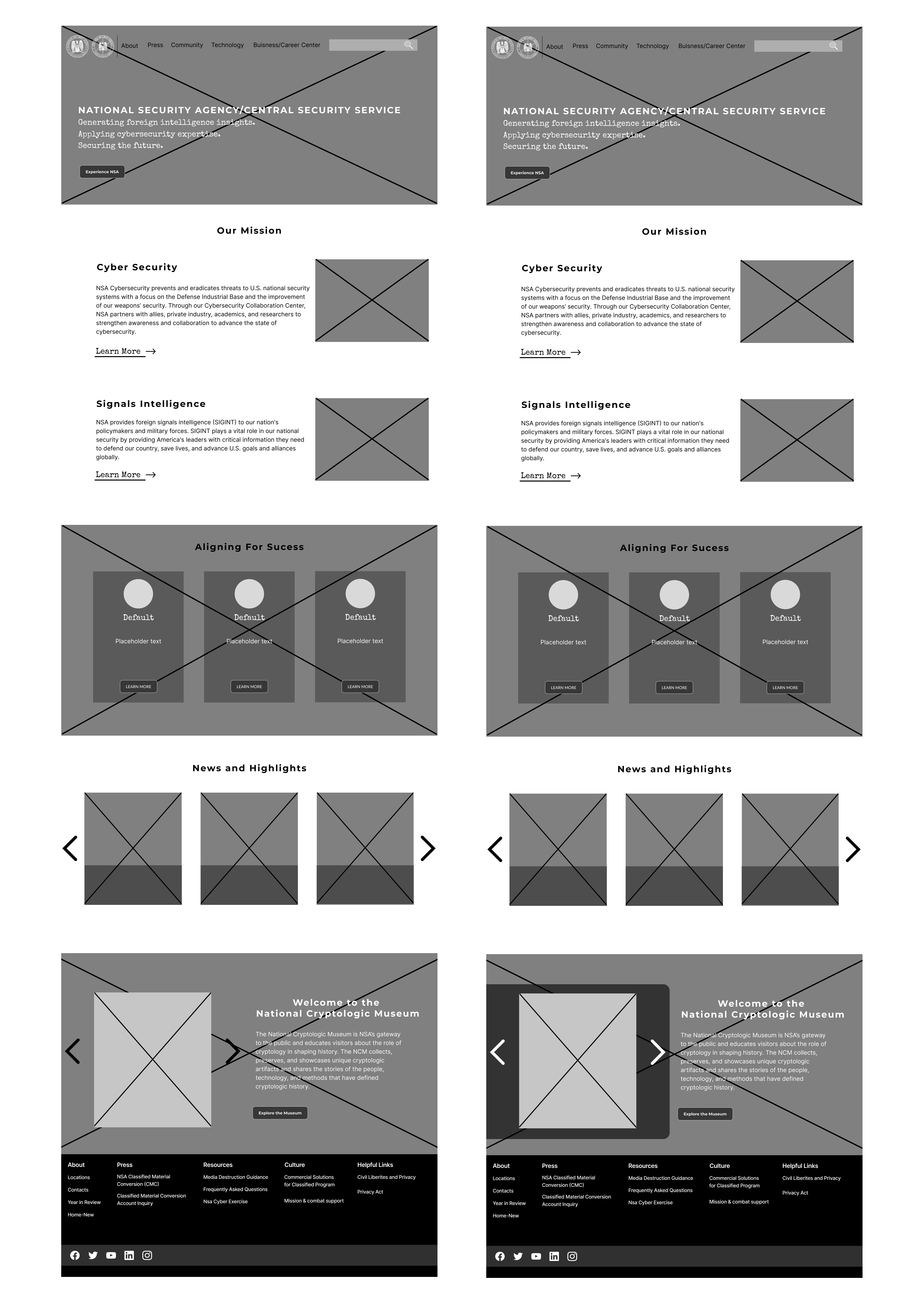
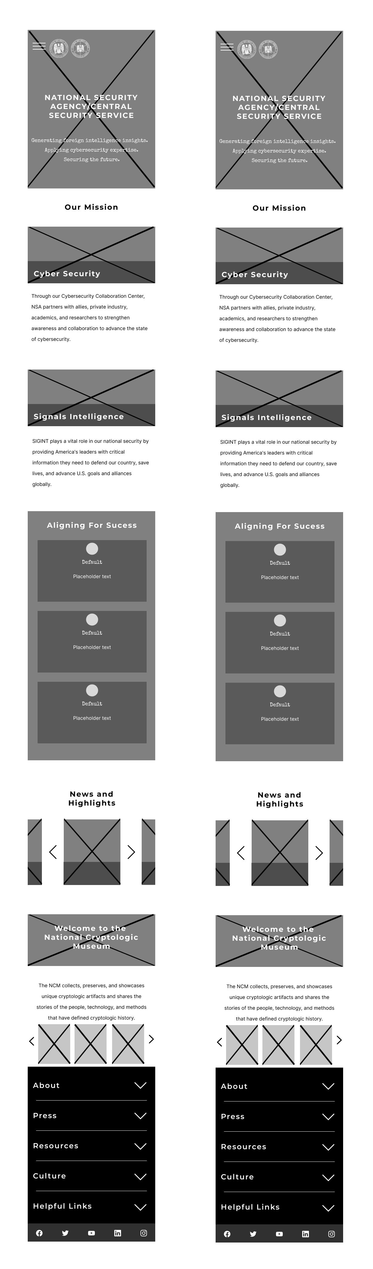
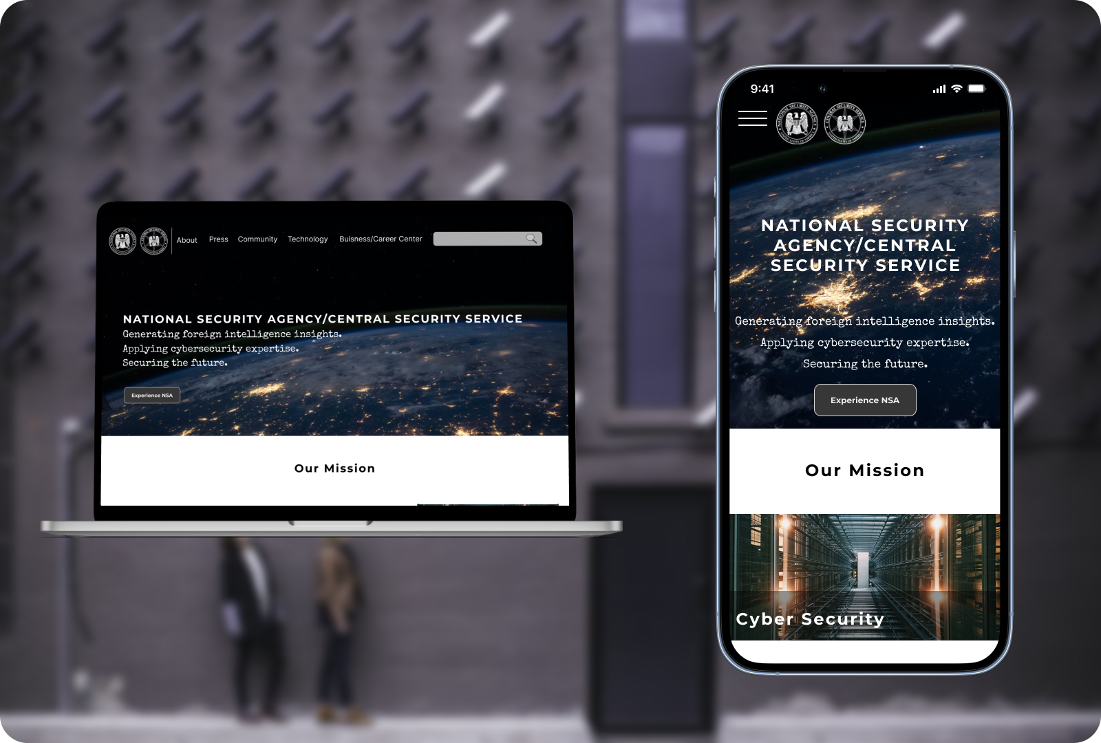
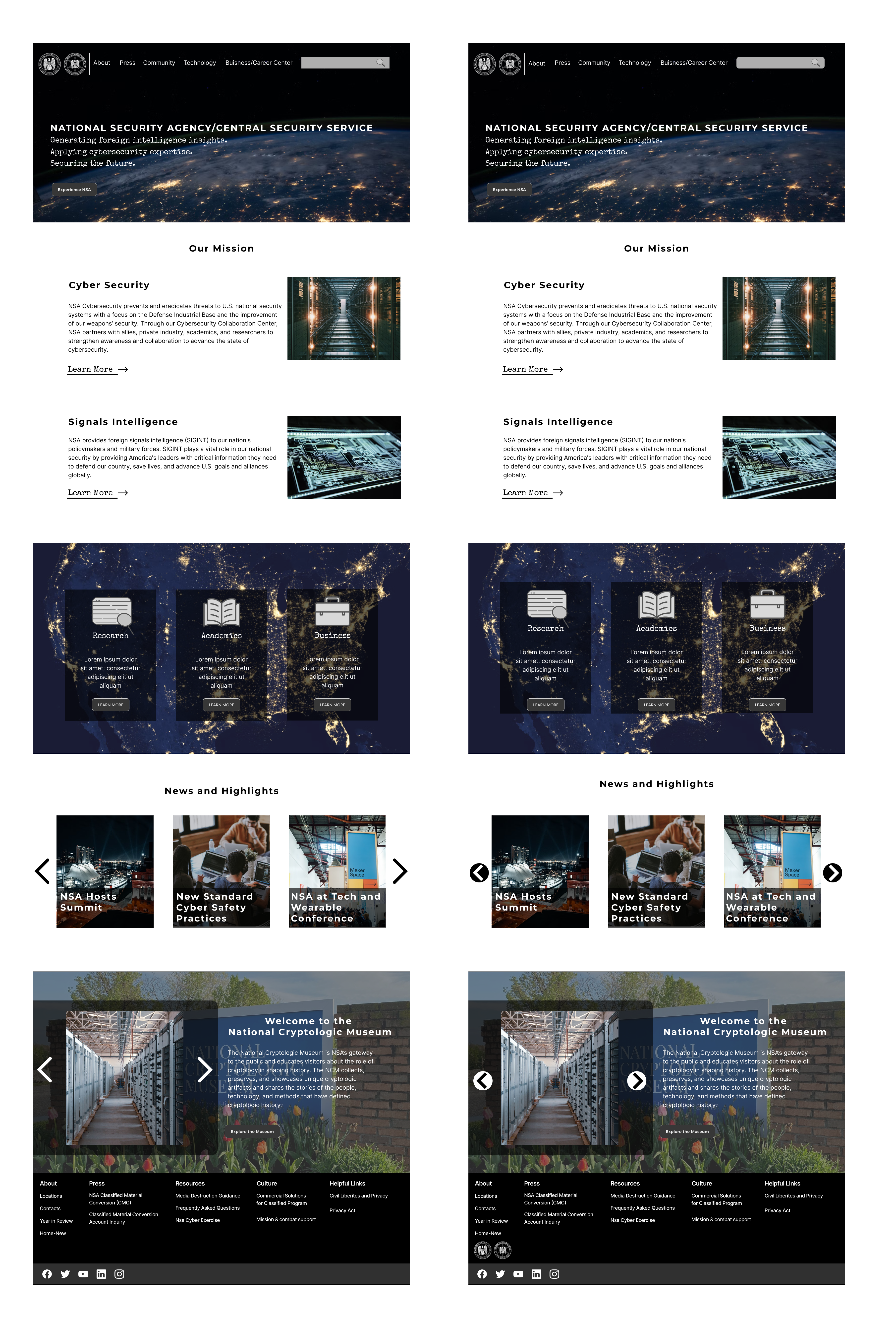
Mid and High Fidelity Prototypes
A final round of tests were conducted and showed me what areas I missed and were lacking, leading to the final active prototypes of the web and mobile page.
LESSONS LEARNED
I would have wanted to explore different element styles and layout given more time, but still enjoyed the design process, and testing out the prototyped versions. Some things I would have improved to create a higher quality design would be:
- Spend less time focusing on the sitemap and simply focus on the initial pages
- Add more elements such as arrow or buttons to increase clarity and user flow
- Design with more white space in mind so the look wouldnt be so compressed and look outdated
More Projects
RENDERWebsite and Mobile Design
RespoAIWebsite, Mobile & Brand Idenity
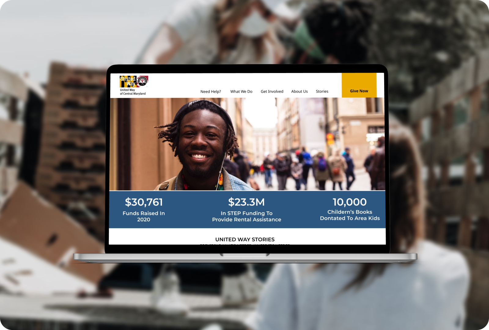
United Health of Central MarylandWebsite Redesign
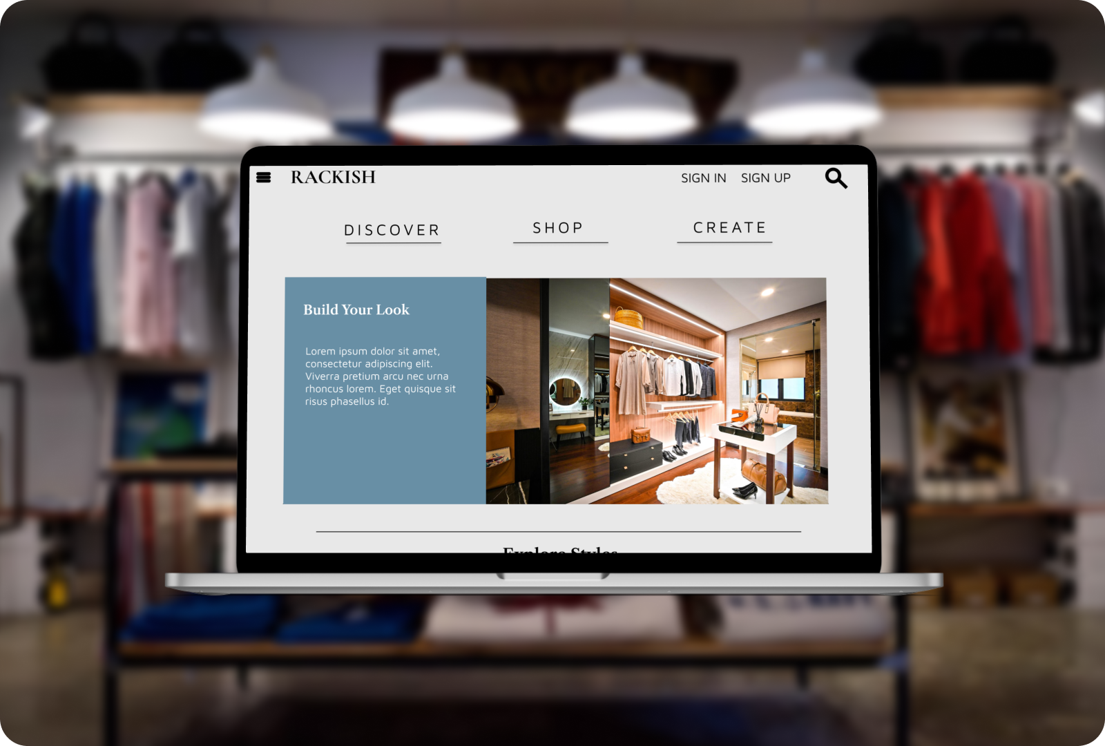
RackishWebsite Design
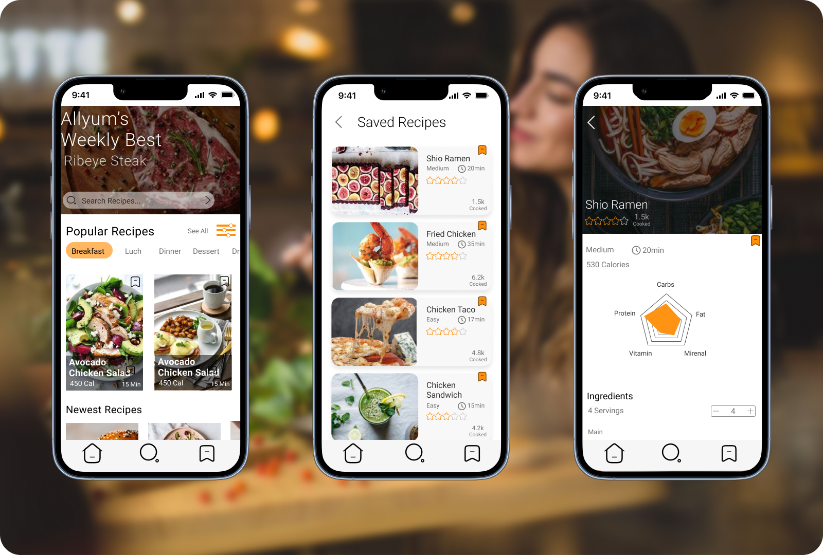
AllYumApp Design
